
From Excel chaos to real-time dispatch
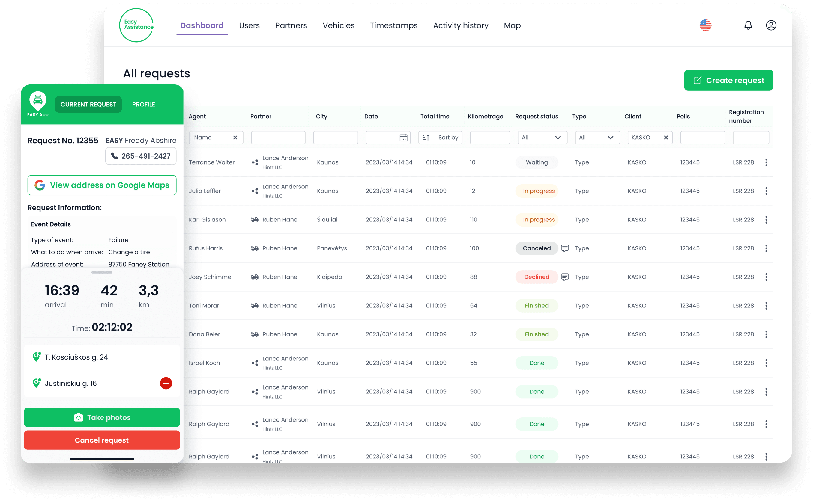
Two integrated platforms - "Easy Assistance" for customer service and "Easy App" for technical staff on the road - connected through a comprehensive help desk with real-time map tracking for rapid technician dispatch.
Key Features
- Real-time map showing staff locations, movements, and routes
- 6 different user roles
- Android & iOS apps to report incidents on the road
- Data export to Excel and PDF
- Automatic emails & notifications for all parties involved
- Extensive activity history for regulatory compliance
Deliverables
- UX/UI Design
- Web System
- iOS & Android Apps
Revolutionizing Operational Efficiency
The client faced significant challenges entering the roadside assistance market. Operations relied on manual Excel spreadsheets and call-centric processes, making it nearly impossible to scale or maintain consistency.
The organization recognized the need for a system with a single source of truth - to systematize and automate data handling, eliminate manual entry, and provide real-time visibility into every aspect of their operations.
Dual-Interface Simplicity
Separate interfaces were developed for customer service agents and technical staff on the road. The design prioritized presenting information in a simple and clear manner, with dedicated onboarding accommodating diverse age groups. The strategy emphasizes cleanliness and simplicity to manage large data sets effectively.
Operational Features
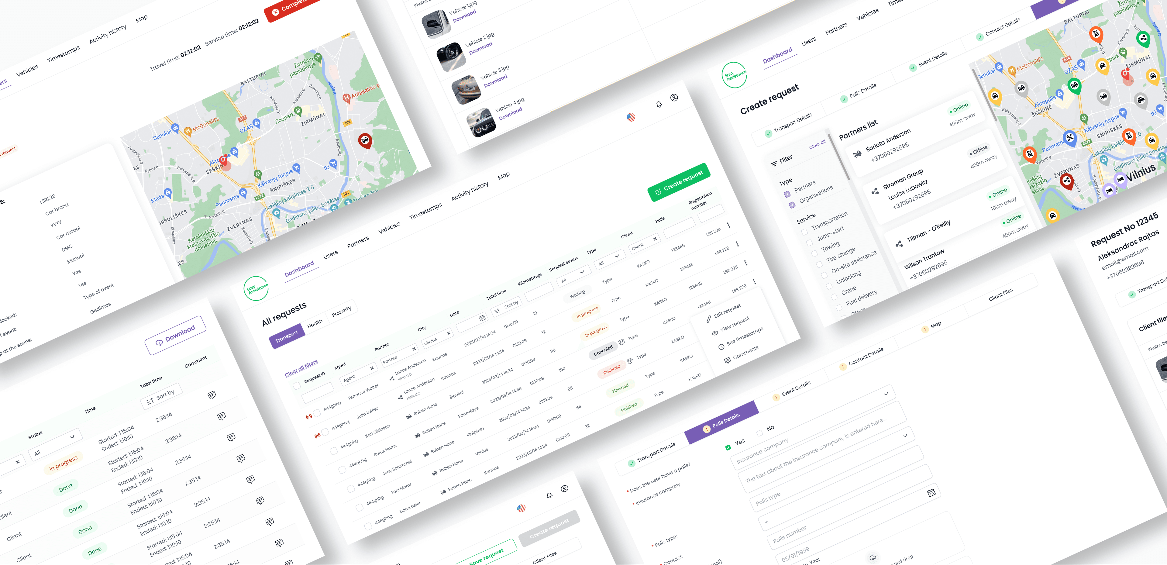
From real-time dispatch to guided photo capture, every feature was designed to eliminate manual work and keep operations running smoothly.
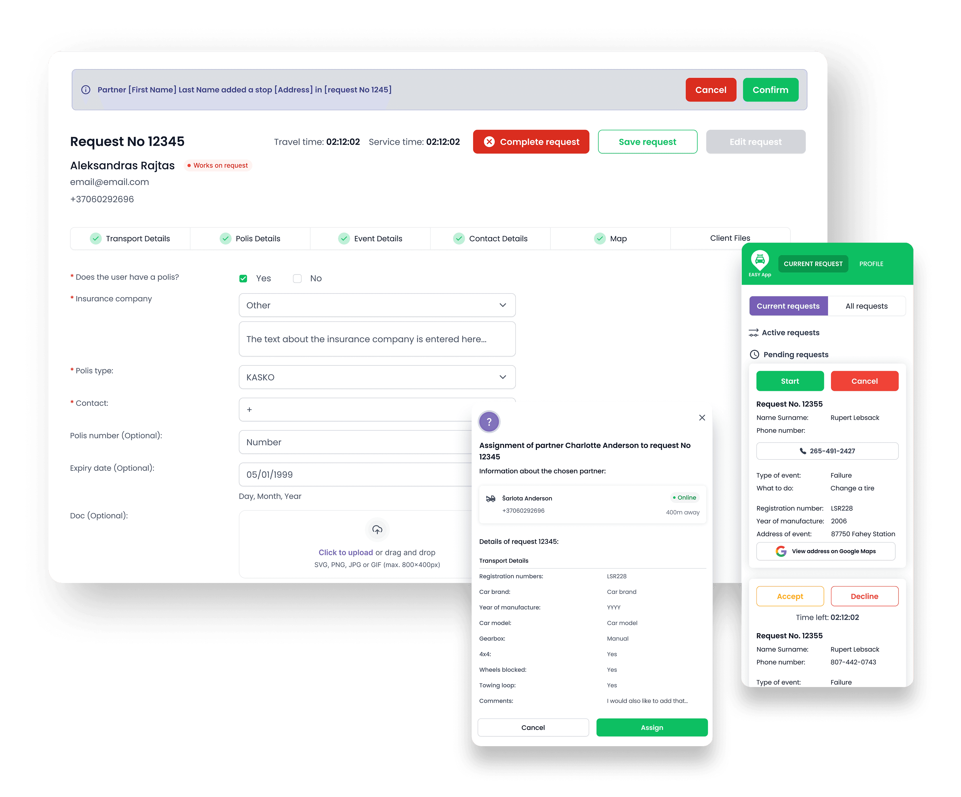
Creating and Processing Requests
Accident requests are logged in the system with all essential information instantly forwarded to the technician app. Real-time data updates are visible across both platforms, ensuring everyone stays on the same page.
Request Management & Communication
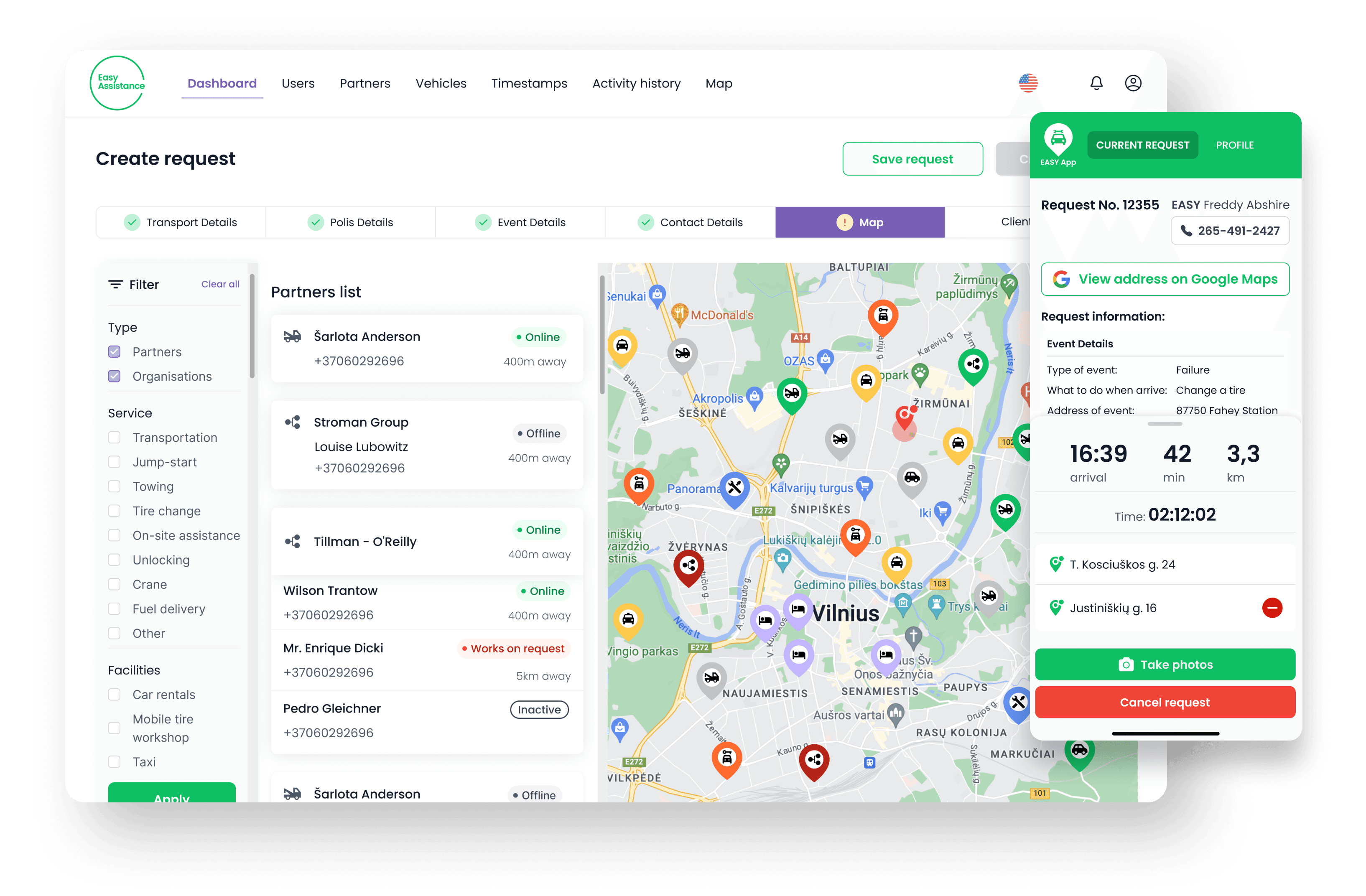
Tables display all requests with statuses, filtering methods, mid-request partner reassignment options, and comment capabilities. The system keeps a complete history for regulatory compliance.
Dynamic Map & Partner Assignment
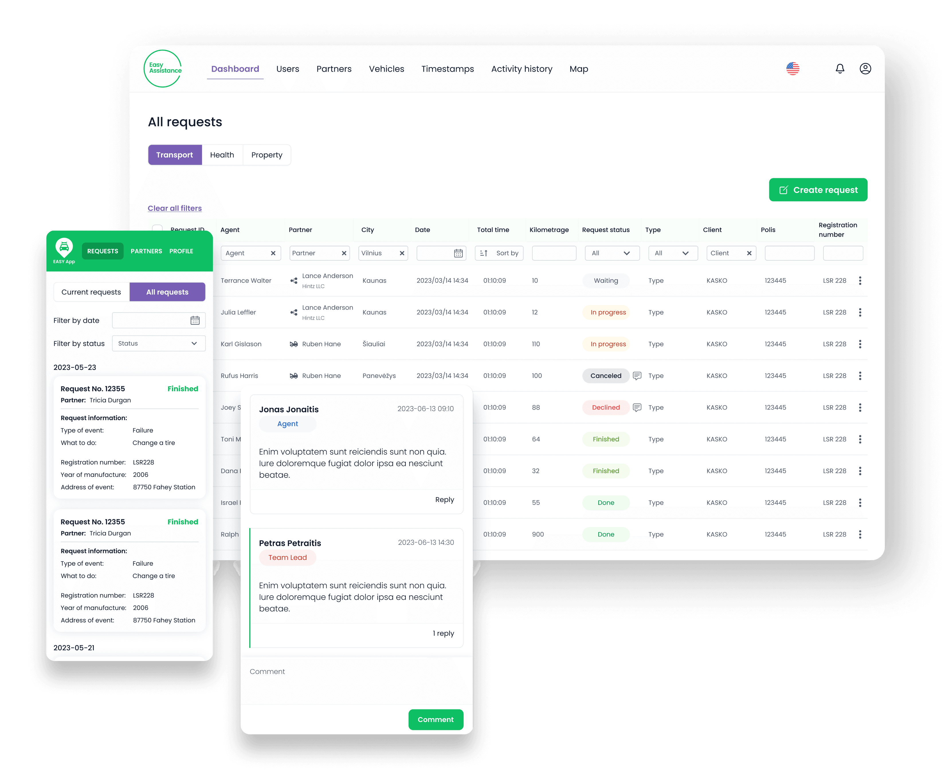
An interactive map displays real-time partner movement with addresses and coordinates for swift incident response. Dispatchers can instantly see who is closest and assign the right technician.
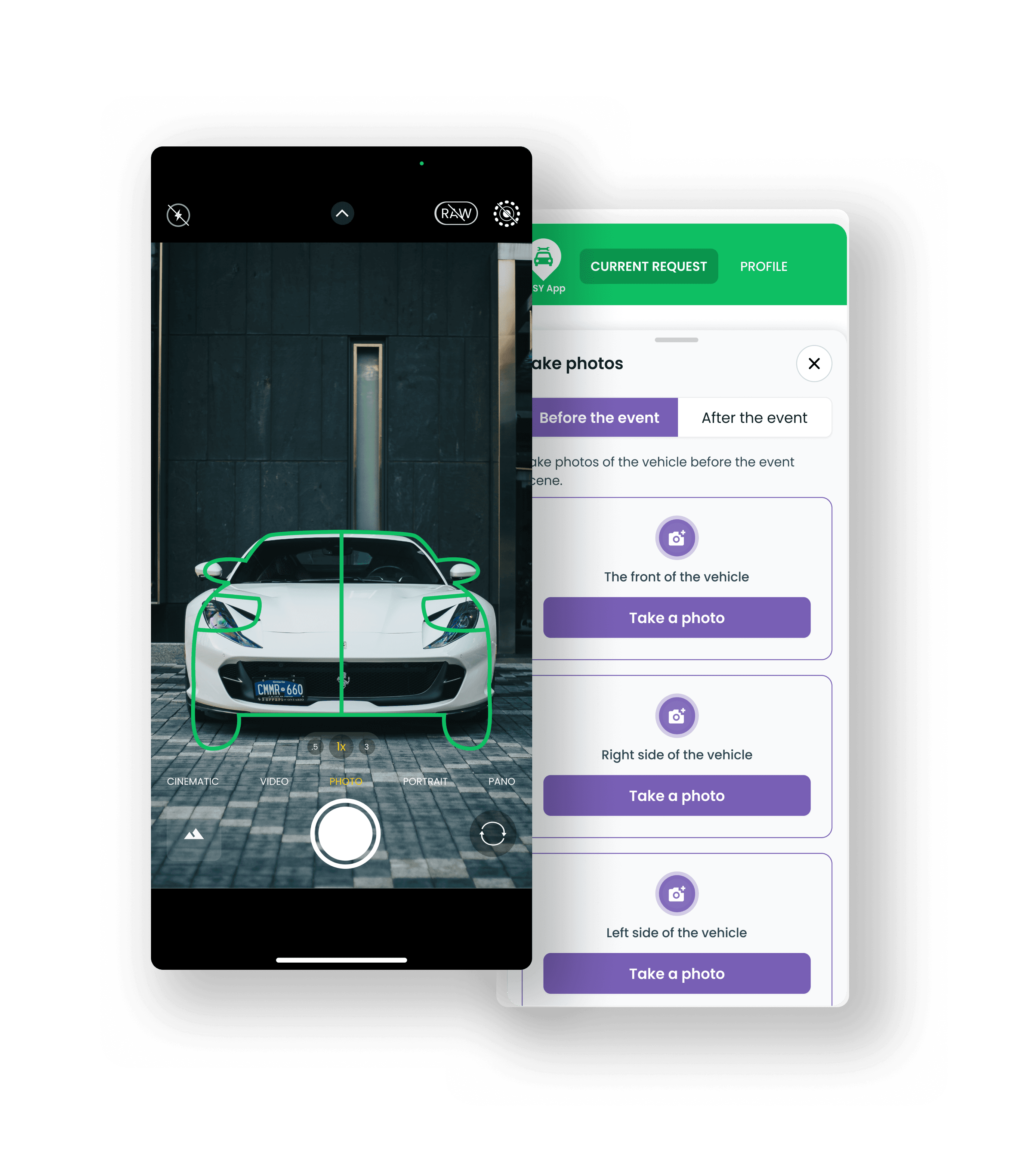
Guided Photo Capture
The native app features guided photo capture indicating specific vehicle parts requiring documentation. Technicians follow a step-by-step flow to capture before and after photos of the vehicle.
Building the System
The web system was built on Bubble.io, providing a rapid development cycle while maintaining the flexibility needed for complex request management workflows. The backend API layer was handled by Xano, enabling robust data processing and seamless communication between the web dashboard and mobile apps.
Systems managing large datasets require clear and simple data workflows and proper data interactions between platforms. The team implemented individual column filters and dedicated search functions, optimizing all functionalities for fast and efficient operation while maintaining simplicity and effectiveness.
Tools Used
The Outcome
Single Source of Truth
100%
All operations centralized in one system - no more scattered Excel sheets or phone-based coordination
Real-Time Dispatch
Live
Interactive map with real-time partner tracking for instant technician assignment to incidents
Dual Platform
Web + App
Seamless communication between the web dashboard and iOS/Android apps for field technicians
30-min free consultation with our founder. No strings attached.

Contact us
Fill out the contact form & schedule a free discovery call

Paulius Medekšas
Business Development Manager
Complete the form and we will provide you with a price and time estimate for development after the call free of charge.